Flooring Colour Psychology: Choosing Shades That Enhance Your Space
How floor colour affects room perception, mood, and flow. Design guidance for choosing colours that work with your space and lifestyle.
Quick Takeaways
- Light floors open up smaller spaces and reflect available light
- Warm tones create welcoming, comfortable atmospheres
- Consider furniture and wall colours together for cohesive design
- Samples viewed in your actual space are essential before committing
- Trends change, but timeless neutrals provide lasting satisfaction
The Psychology of Floor Colours
Flooring occupies the largest horizontal surface in any room. Unlike wall colours that can be repainted, floor colour represents a long-term commitment. Understanding how colour affects perception, mood, and spatial experience helps ensure choices you'll love for years to come.
We've helped countless London homeowners navigate colour decisions, and the most common regret is choosing trends over timelessness. This guide explores the principles that lead to satisfying floor colour choices.
Light, Medium, and Dark: Understanding the Spectrum
Light Floors: Space and Freshness
Light floors (blonde woods, pale greys, whitewashed effects) have dominated recent trends. Their appeal:
- Space enhancement: Light floors reflect light, making rooms feel larger and brighter
- Contemporary feel: Scandinavian-inspired interiors favour pale tones
- Flexibility: Light floors work with most furniture and décor styles
- Natural light maximisation: Ideal for north-facing or naturally dark London rooms
Considerations: Very pale floors can feel cold or clinical without warming elements. They show dirt and scuffs more readily than mid-tones. White-washed effects may date as trends evolve.
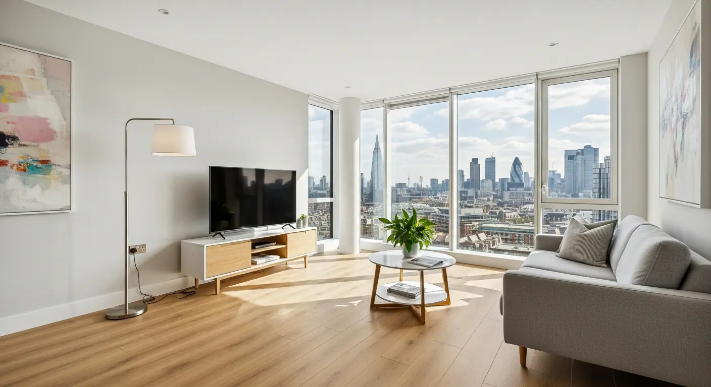
Medium Tones: Versatility and Warmth
Medium tones (natural oak, honey, warm beige) offer balance:
- Timelessness: Natural wood tones never truly go out of fashion
- Warmth: Warmer than pale floors without heaviness of dark
- Practicality: Best at hiding everyday dirt and wear
- Versatility: Work with traditional and contemporary furnishings
Our recommendation: For most London homes, warm mid-tones provide the best long-term satisfaction. They create welcoming atmospheres while remaining practically forgiving.
Dark Floors: Drama and Definition
Dark floors (walnut, espresso, charcoal) create impact:
- Drama: Dark floors make powerful design statements
- Furniture highlighting: Lighter furniture 'pops' against dark floors
- Luxury perception: Dark finishes often read as more luxurious
- Grounding: Dark floors anchor rooms with high ceilings or pale décor
Considerations: Dark floors show dust, scratches, and watermarks prominently. They require more frequent maintenance to look good. Very dark floors can make rooms feel smaller and heavier.
Undertones and Coordination
Beyond light/dark, undertones affect how floors work with other elements:
Warm undertones (yellow, orange, red) create cosy, welcoming spaces. Natural oak, cherry, and golden finishes belong here.
Cool undertones (grey, blue) feel more contemporary and formal. Grey-washed wood, cool beige, and charcoal finishes work in this direction.
For successful spaces, maintain consistency between floor undertones and other fixed elements - cabinetry, tiles, and large furniture pieces should share warm or cool orientation.
Practical Colour Choices
For Families and Pets
Busy households benefit from mid-tones with natural variation. Wood-effect flooring with visible grain hides dirt between cleans. Avoid uniform light or dark tones that show every mark.
For Rental Properties
Neutral mid-tones appeal to the widest tenant pool and hide wear between tenancies. Avoid fashionable colours that may date or polarise opinion.
For Resale Value
Timeless naturals (warm oak, honey tones) appeal to most buyers. Avoid very dark or very light extremes, or fashion-forward colours (grey has peaked). Quality and condition matter more than specific colour.
Sampling Process
Flooring colour looks dramatically different in showroom lighting versus your home. Always:
- Request large samples (small chips don't represent installed appearance)
- View samples in every room where flooring will be installed
- Check at different times of day and in artificial lighting
- Place samples against fixed elements (cabinets, tiles, furniture)
- Live with samples for several days before deciding
Regional and Cultural Considerations
Colour preferences vary by region and cultural background. Scandinavian-influenced design favours pale, blonde woods that maximise light in northern climates. Mediterranean interiors embrace warmer terracotta and honey tones. Asian-influenced design often features darker, richer woods or minimalist pale palettes.
London's international property market means buyers come from diverse backgrounds. For maximum resale appeal, neutral tones that work across cultural preferences are safest. For personal homes, embrace colours that resonate with your own aesthetic traditions.
Working with Existing Elements
Most flooring projects involve working around fixed elements - kitchen units, bathroom tiles, built-in furniture. Consider how flooring colour interacts with these unchangeable elements:
- Dark kitchens: Light floors prevent heaviness and create contrast
- White bathrooms: Wood-effect LVT adds warmth without clashing
- Period features: Traditional wood tones often complement original fireplaces and cornicing
- Contemporary fittings: Cool greys or pale woods suit modern minimalist interiors
Take photographs of fixed elements when viewing flooring samples to check compatibility outside your home.
Colour Trends: What to Embrace and What to Avoid
Flooring colour trends shift slowly compared to fashion or paint colours, but they do change. Grey flooring dominated the 2010s but is now considered dated by many designers. Very dark espresso tones have waned in popularity. Currently trending are natural, honey-oak tones, limewashed effects, and warm whites.
Our advice: embrace trends cautiously. Flooring is a 15-25 year commitment. Timeless naturals rarely date, while fashion-forward colours may feel tired within a decade. If you love a trendy colour, consider it carefully against your long-term plans for the property.
Conclusion
Floor colour is fundamental to room atmosphere but shouldn't be an anxiety-inducing decision. View large samples in your actual space, trust warm mid-tones if unsure, and prioritise timelessness over trends. Quality flooring in a well-chosen colour provides decades of satisfaction. Work with specialists who can guide you through the colour selection process and help you visualise the installed result.